(12/11/2024)
link to play — Prototype_1 Illusion of Choice
Brief Description
You are a robot in a post dooms day world. A mysterious software update is pushed allowing you to see colours. It’s your job to solve the puzzle using your colour switching ability, without overheating.
The puzzle is meant to be simple to solve, but offer the player two choices — go down the scenic route and risk over heating, or go down the linear, suffocating route but win easily.
Introduction
The prompt given for the week was ‘Illusion of choice’. I ended up making two iterations on the same prompt with vastly different end results, and so I’ve decided to document both.
Iteration 1 — I worked on Iteration 1 during the same week. I made numerous mistakes while working on it, which led me to embrace the “fail fast, learn fast” mindset. This experience sparked a series of thoughts in my mind about the essence of creating something ‘fun’ and what it truly means to make a ‘toy’.
Iteration 2 — Iteration 2 was developed during the Christmas vacation. It was more focused on creating a ‘toy’ to compensate for the failures of iteration 1.

Iteration #1 — Thanatos
Link to download the file -> Illusion of Choice.html
Being my first attempt at making any sort of game, I went in headfirst, fully prepared that I was probably going to make something that wasn’t too great.
I come from an arts background, my Bachelors was in making animations and films. Naturally, when I think about making something the first thing that comes to my mind is how the aesthetics contribute to the making the user feel something.
The moment I got “Illusion of Choice” as the first prompt, I immediately thought this was a writing assignment for a choice-based game. I started thinking about the different ways I can play with the player’s emotions. I thought about the ways I could make two different players feel 2 different things, and how that would influence their choice.
Pre-Production
From the beginning, I knew I wanted the story to be linear, but to make different Players feel different things. And I knew I wanted the player to only make 1 difficult decision towards the end of the game.
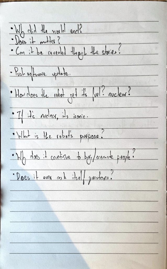
I began to think about this sort of Wall-E archetype. The world has ended, and for some reason its your job to clean up the corpses left behind. You don’t know why you do it, you just do. And I wanted to mix it in with this sort of Chappie idea about injecting consciousness into a machine.
So what would happen if you suddenly made a machine conscious after the world is destroyed?
I had a basic structure in mind, and I knew I wanted to implement that.
I figured if I wanted to make it fast, I would have to use Twine. I knew if I wanted to have something functional, I would have to focus more on Aesthetics, Story and Mechanics, in that order.
I decided to pay heavy focus on the story for the time being and worry about mechanics later, which in hindsight, I feel like I completely ignored making any sort of mechanics, which was a fatal mistake.
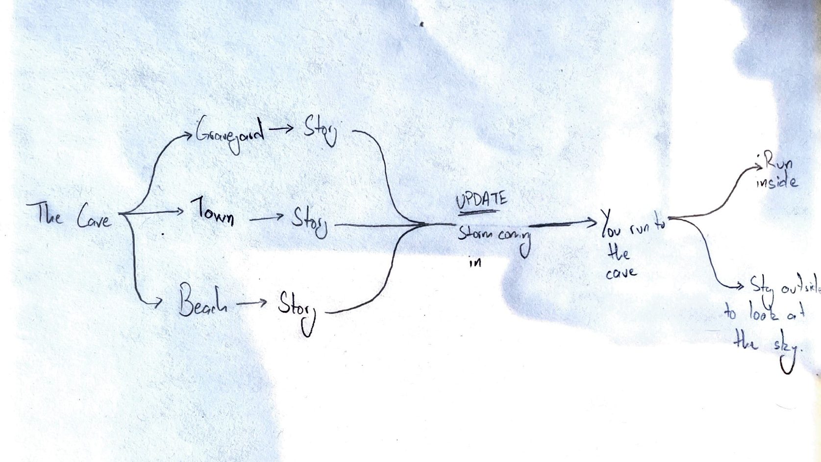
The Story
These are some of the pages of my base idea for the stories.
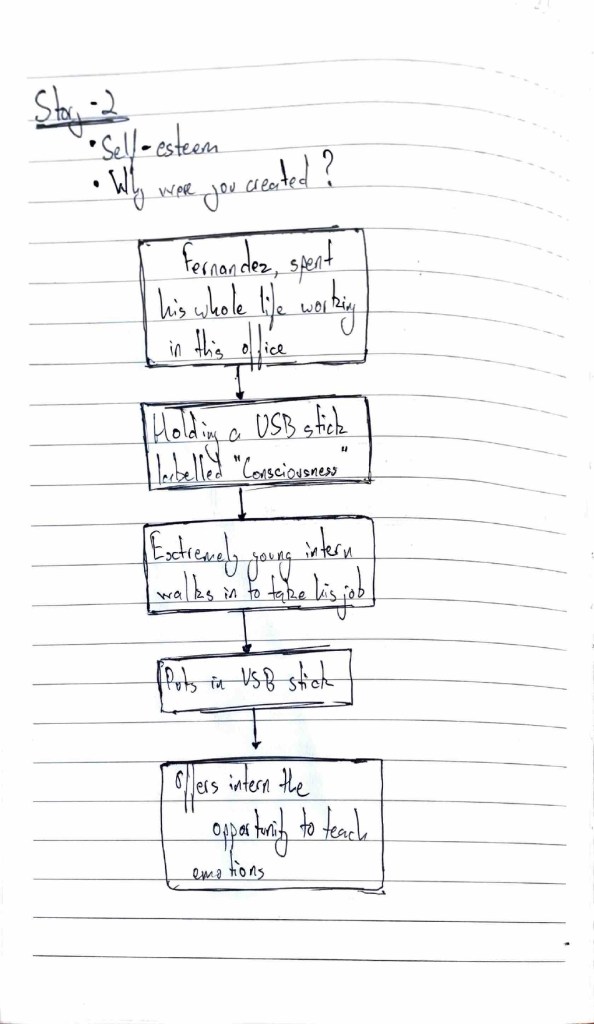
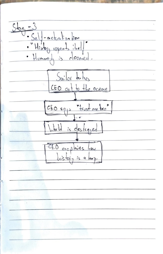
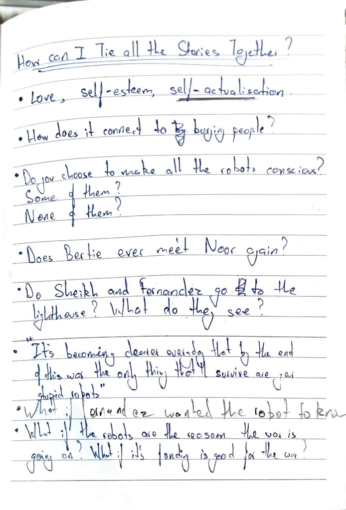
The basic idea was meant to mimic three of the Maslow’s Heirarchy of Needs, the three stories were meant to signify:
- Love
- Self-Esteem
- Psychology
I chose only the three because, in a world where everyone knows everything is doomed, one can assume that the basic needs of safety and psychology are already abolished.
One of the core mechanics for the game, was that in the beginning everything would be desaturated, and the more you played it things would appear to get more and more colour, signifying the consciousness fully manifesting itself into the robot.
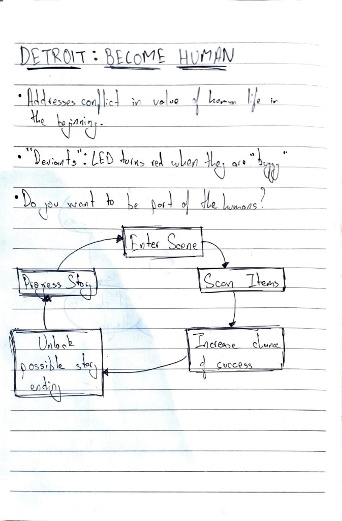
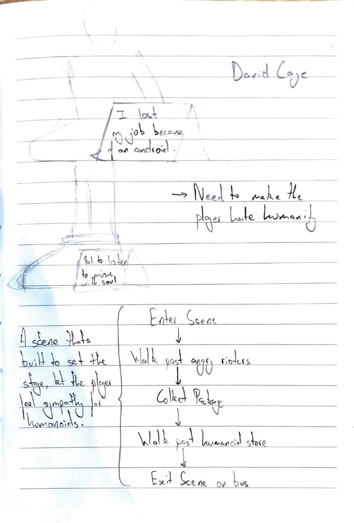
I also ended up taking inspiration from games like “Life is Strange” and “Detroit: Become Human”. And while making the game, I kept thinking of the different verbs and mechanics that would give the player a more immersive experience to communicate the emotions that I would want them to feel.
Maybe because of the limitations of the medium, Twine, or maybe because I wasn’t paying enough attention to these mechanics/ verbs, a lot of these mechanics didn’t make it through to the final version of the game.
Production
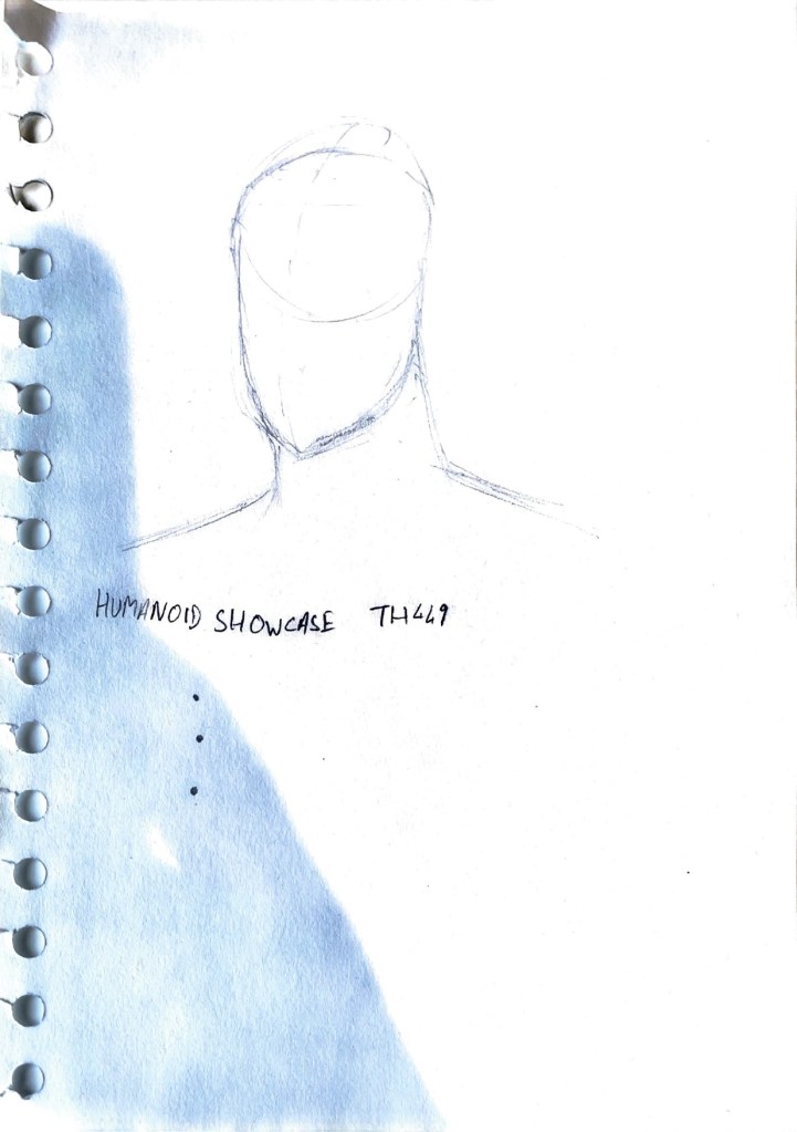
I used twine to make a sort of interactive story. many of the images were made using ChatGPT, or made by me on Maya.

I did realise a lot of things on the way, like coding in Twine is not as intuitive or user friendly as coding in visual studio, and that twine still has a lot of limitations. It took me half a day to figure out how to simply link an image, until I realise that the images don’t show up on the preview website and you need to export it to an html file.
Creating images for this project was also a pain, because I don’t know how to illustrate, and although I’m pretty good with Maya, spending that kind of time making images for a project didn’t seem unreasonable, especially since I needed to figure other twine as well.
If I had to go back and do this all over again, I would probably have chosen a combination of Unity and Inky. I know that when you’re prototyping, the tool doesn’t matter, but at the same time, it’s really useful to know the tools you’re working with, their limitations, and the potential. And at the time I knew unity the most, and could have expanded my knowledge more which could’ve helped in my 2nd and 3rd prototype as well.
Iteration #2 — Color based exploration
link to download –> Iteration 2
A large part of the reason I didn’t like my first prototype was because it leaned so much on the story that at the end of the day it just wasn’t fun. On play testing it, a lot of people would simply pass by it, click a couple buttons, realise it’s too long for them and then move on.
There was the sense that I wasn’t able to captivate the audience’s interest in the first five minutes, but I honestly believe even if the first five minutes were interesting, the game as a whole lacked potential because there were just no mechanics.
For my second attempt, I wanted to make something that heavily focused on the mechanics of the game.
Pre-Production
A large part of my focus was on making something that was ‘fun’, and as simple as a toy. I still wanted to rely on the old iteration’s story, even though it was completely irrelevant in this whole pursuit of making a toy.
I started by listing out all the mechanics that could fit in with the previous games.
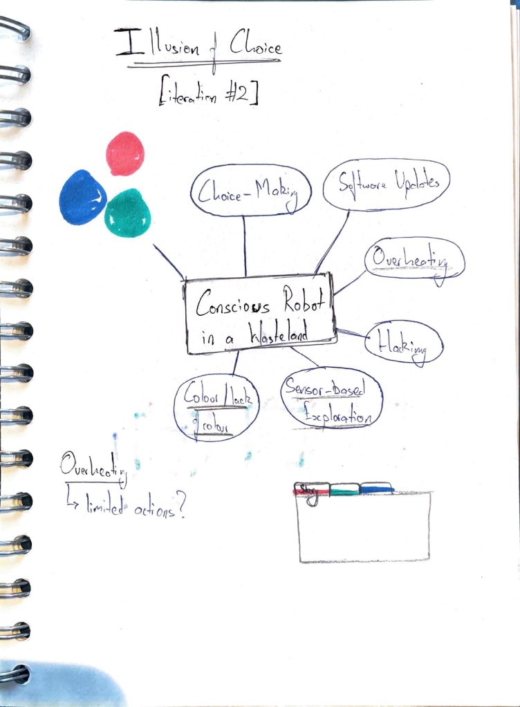
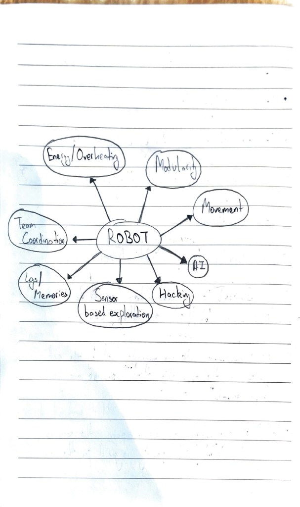
The three that really stood out to me were:
- Choice-making
- Color/Lack of color
- Overheating (limiting potential based on energy)
These are all things that could get the gist of the previous game while giving the player the experience of being this robot.
I started trying to figure out these different verbs mean, I wanted to understand how I could incorporate these things into my game.
Overheating was an easy one, because that was just code for “Limited choices”.
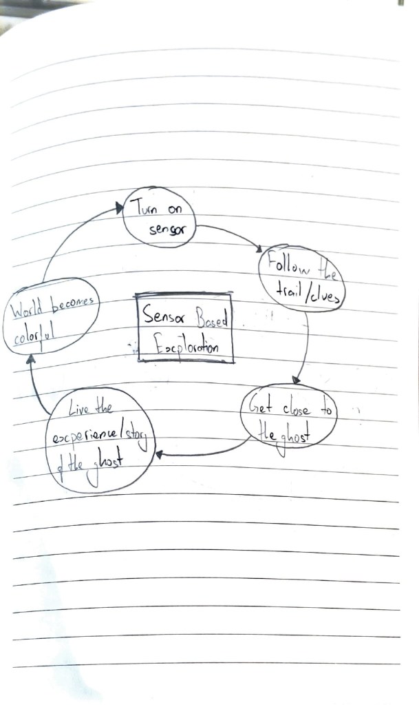
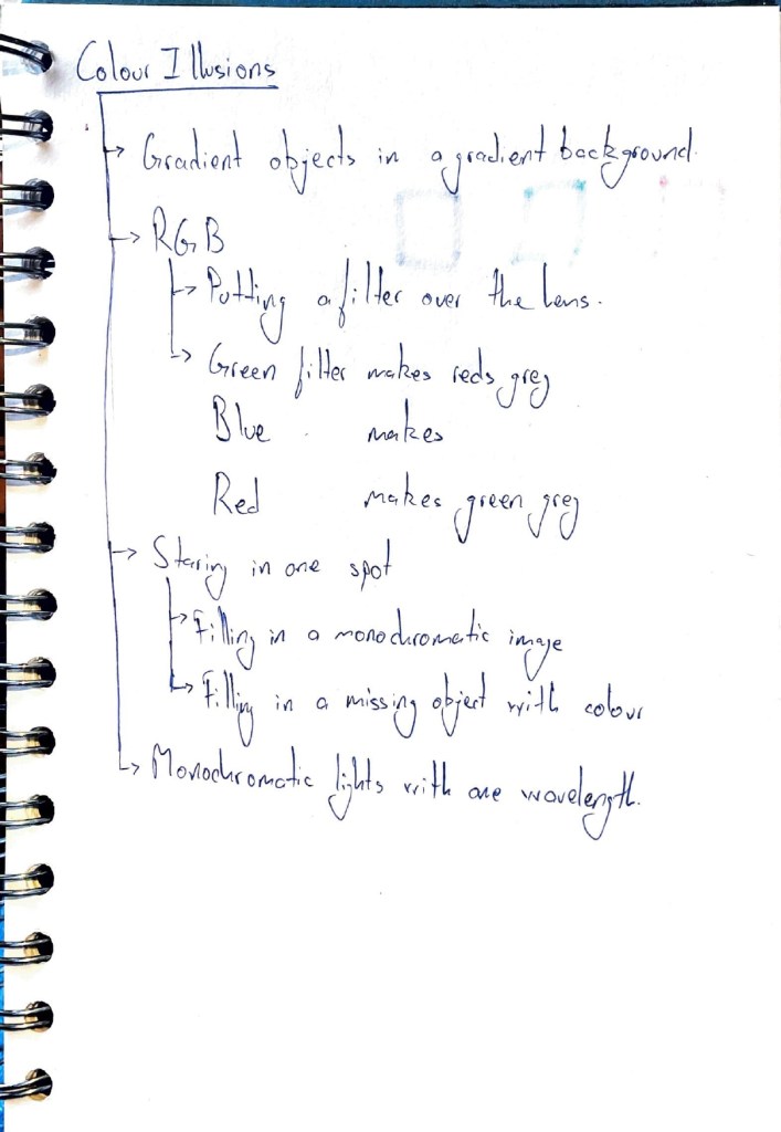
For the color I decided I wanted to make it a part of the exploration mechanic. While I was making this I was trying out double exposure photography and learning about how multiply works. I realised that when you put a Red/ Blue/ Green filter on the camera, it tends to grey out one of the colours, and I decided I wanted to use this as a core mechanic for the game.
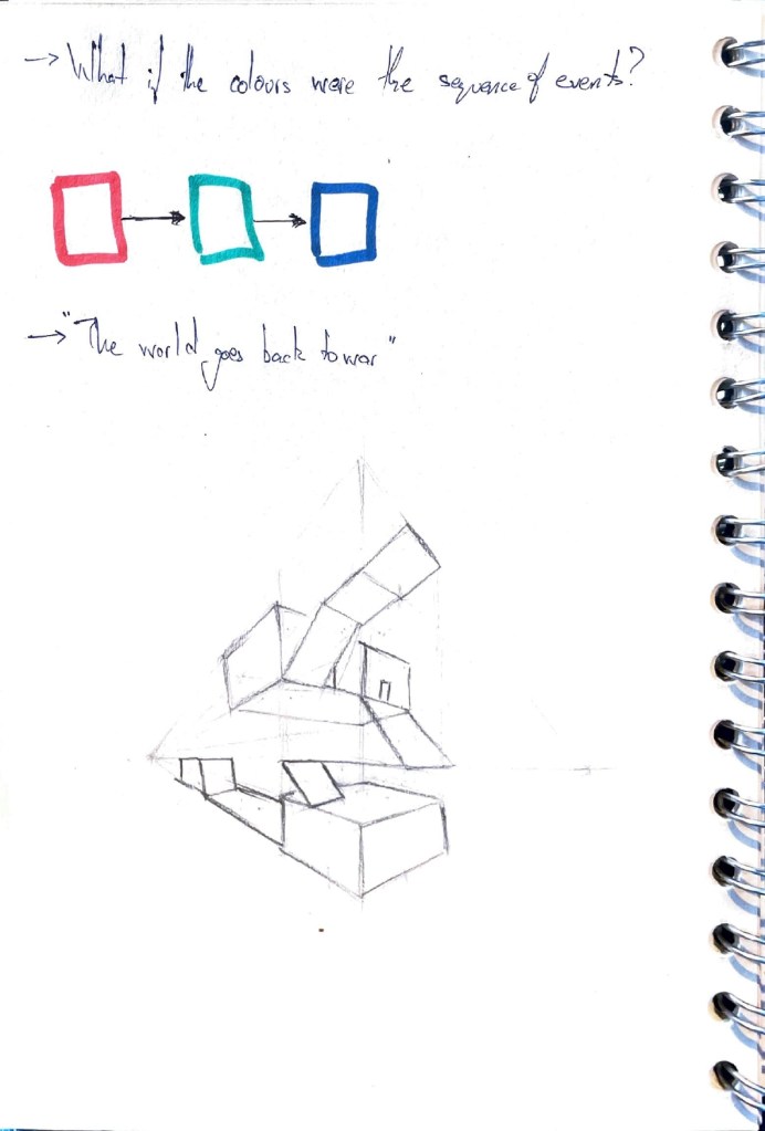
This also ties in well with how in the previous iteration, one of the core mechanics was the more conscious you got, the more colours started appearing.
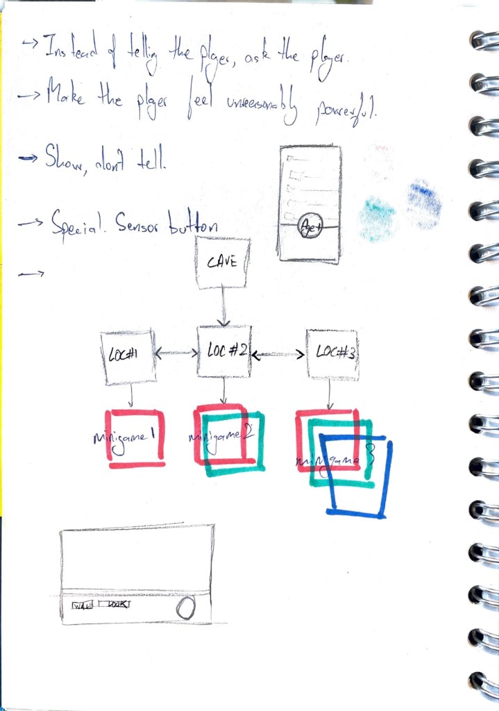
The choice-making part was something that took me a long time to figure out, until I started researching on the level design.
While I was researching on if I could make the level vertical, I stumbled on this image

I realised that if there was a start point at the top, and an end point at the bottom, the quickest way down would be through the middle. Which played in well with the whole “limited number of choices” mechanic.
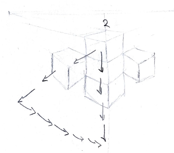
If I wanted to distract the player, and make them take the longer route, I could make the longer route the more scenic one, which tied in well with the first iteration about how the robot is learning about consciousness.
combining these two, it sells the illusion of choice. If you want to win, take the boring route, and if you don’t want to take the boring route, you lose.
Production
Since this was the beginning of my Christmas vacation, I had already worked on unity in the previous 2 prototypes. I was starting to get the hang of the software so I stuck to unity while making this.
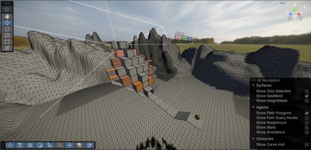
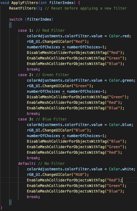
The base mechanic of the game, which was about being able to pass through walls of a certain colour if the filter was of the same colour, was implemented in code using global volumes and mesh colliders.
Most of the code was controlled using a ‘ApplyFilters’ function, which was a switch case which alternated the colour filter based on the ‘interact’ button.
In order to make the scenic route scenic, I had to learn unity’s speed tree and terrain tools. I used graph shaders to make the wood material for the rooms on the sides of the structure to really make it look more scenic.
This eventually makes the rooms in the middle feel dull, grey, and claustrophobic. While the rooms on the side of the structure are open, airy, and give them a view.
Conclusion
I think I can say that objectively, this project has been more of a failure as a prototype. The second iteration does raise some interesting observations, like philosophically speaking, it makes you question if taking the long scenic route really is losing.
Overall however, it’s been.a huge learning experience for me. I especially loved the play testing workshop we had that week, even if I felt a bit out of place with my game, it gave me a lot to reflect on. It started a chain of thoughts for me about game development, and made me more interested than ever.
Bibliography
‘Pinterest’. 2024. Pinterest [online]. Available at: https://in.pinterest.com/search/pins/ [accessed 26 Dec 2024].
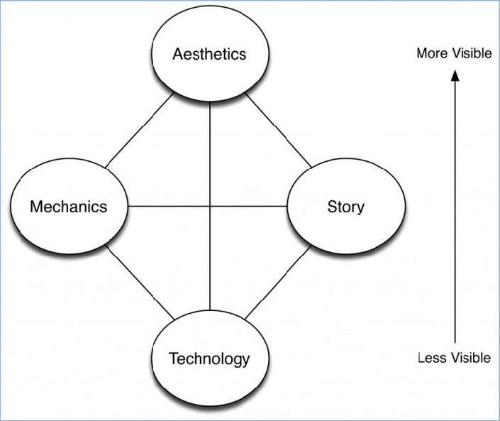
SCHELL, Jesse. 2008. ‘The Elemental Tetrad’. In The Art of Game Design. 104.

Leave a comment